
Sometimes, we all want the information we provide to really reach out to people. It could be about using a particular product, or about why we need to save the environment. And when we have some solid facts, we need just the right way to present them. Did you know that designing infographics is the perfect answer to your requirement?
The name itself tells you what they do – they provide you with information that is supported by visual representation. These visuals or “graphics” can be icons, images, charts, or maps.
So, while designing infographics, how to choose which one will work for you? In this blog post, we’ll learn the types of content that an infographic can have. Based on the information or message you have; you design your infographic accordingly. Let’s understand with examples.
Designing Infographics Based on Content
Infographics can summarize an entire article in one single image. You can also use it to support your speech in the middle of a presentation. In fact, the best presentations you see are always supported by data, charts, and infographics.
Here’s how we identify the type of content while designing infographics:
Timeline
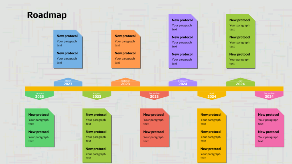
Let’s say you want to tell your audience a story in a chronological order. Or, you’re at a meeting and want to explain how a particular project is going to proceed. If you’re keen on mentioning the dates – be it historic or futuristic, you use a timeline.
Process Description
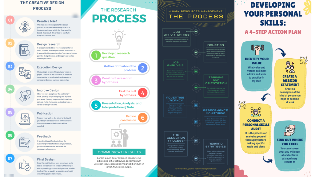
When you want to tell a step-by-step method of using a product or doing a particular task, you include numbers or arrows in your design. The format you use can be straight, S-shape or zig-zag, but it needs to explain that step 1 comes before step 2. You can also use this to teach something.
Data Visualization
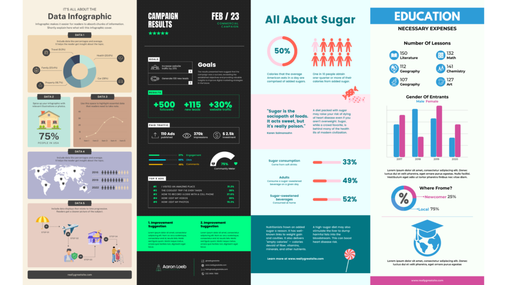
Nothing works better than numbers. Whether you’re reflecting upon insights of your company’s performance or analyzing the current scenario in the industry before you proceed with your plan, statistics presented with bar graphs, pie charts, and other methods work the best if you have them.
Maps and Locations
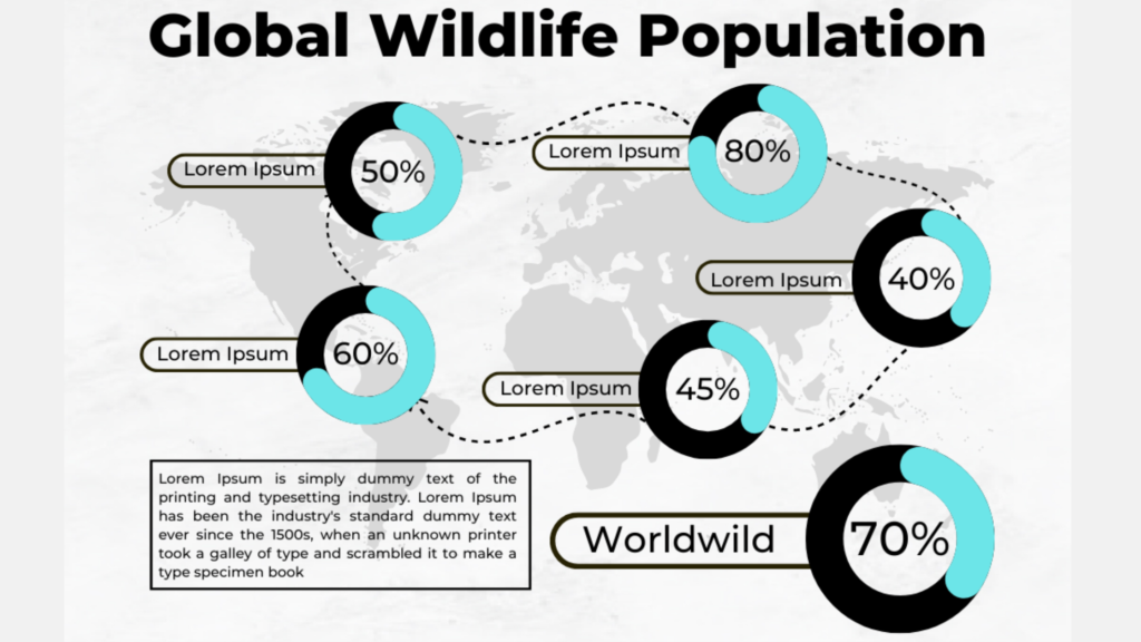
If you’re telling people in a board meeting about the various geographic locations the company has expanded to or spreading awareness on the impact of climate change all over the world, using maps can really help. Depending on whether you need the world map or highlight only a specific country or continent, you can choose the layout to be portrait or landscape accordingly.
Lists
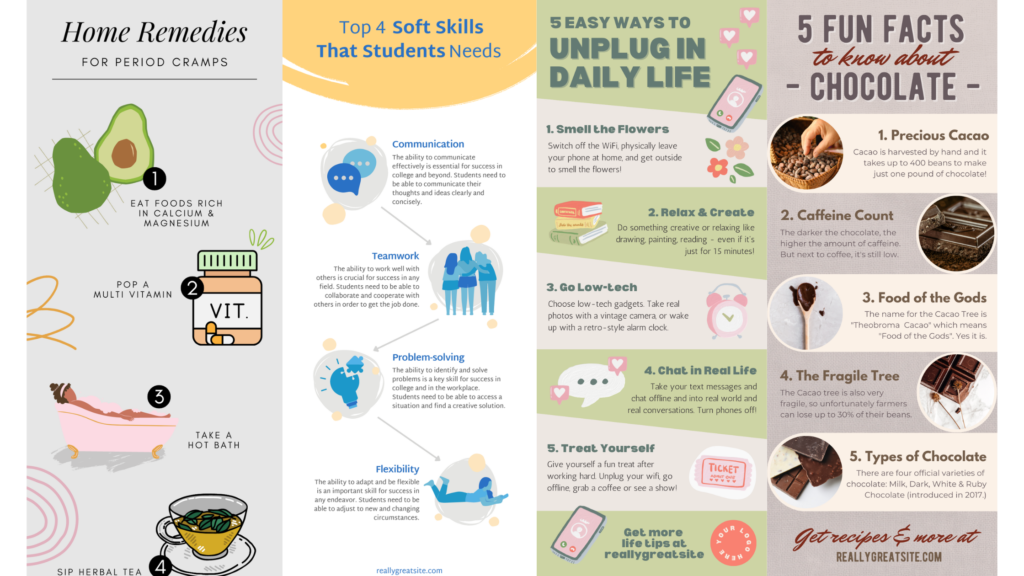
Mostly when you’re writing articles mentioning fun facts or benefits about something, or provide tips or may be a top-5 list of something, then designing infographics becomes an easy job for you. Since the list is usually the key part of the topic, there are many ways of summing it up in one long image.
Comparison
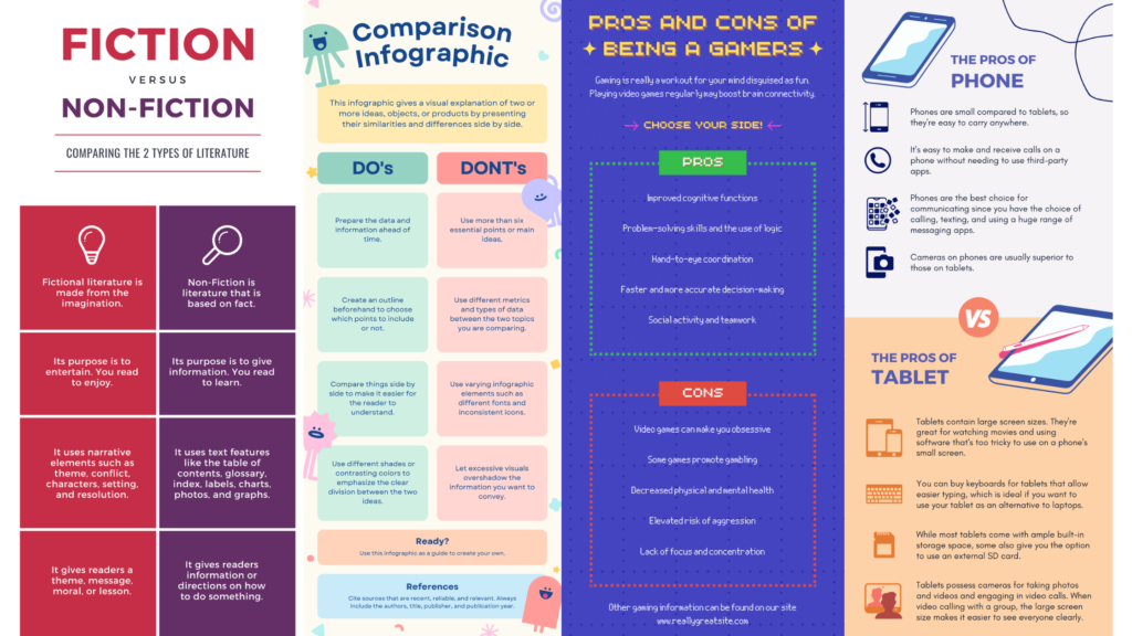
Dos and Don’ts, this vs that, pros and cons – these are all different ways of comparing things. When you really need to analyze one or two products in depth, these infographics can really support you to make your point. You just divide the layout either horizontally or vertically and also use colours to point out the differences.
Information
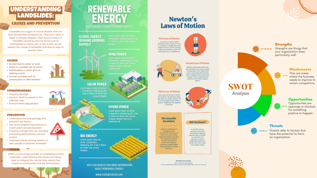
When you want to summarize an entire article or presentation, you might not have a very specific format to mention. In other words, it’s not just one list or one process. you could be having multiple things and wanting to give more details. That’s when you use a free format of informational infographics.
Resume

Even a resume can be an infographic, if you support your information with visuals such as bar charts, pie charts, and various icons for basics like phone, email, and address. You can also use colours and patterns to make your resume more attractive. You can really make your CV unique by using these simple tactics.
Hierarchy
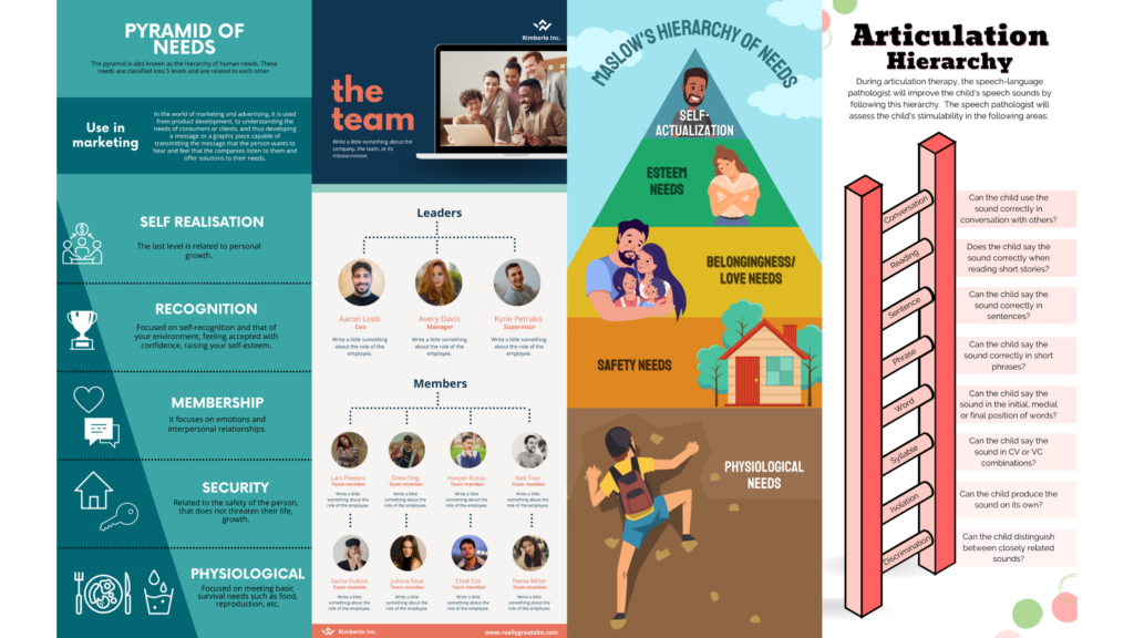
If the subject matter you’re explaining has a hierarchical structure like a pyramid or ladder, you may want to use the exact format. When you make a pyramid in an infographic, you can keep it as subtle or illustrative as you want it to be.
Anatomical
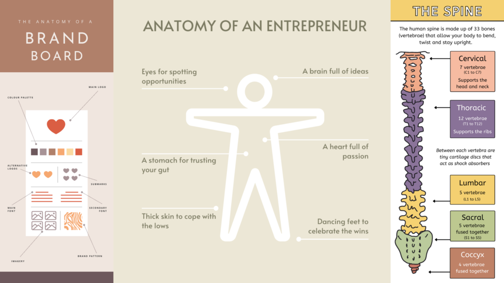
These infographics are pretty different from the others. This is because, here you mainly try explaining one particular structure. It is more like the diagrams we’ve drawn in our biology classes in school – labelling a single image. The difference is that sometimes, the structure or “anatomy” can be more personalized.
Other Ways of Designing Infographics
We just discovered 10 different ways of designing infographics, based on the type of content you have. Once you know what you need to explain and how you want to explain it, we come to the size of the layout.
The most common format is a vertical one, which is usually 800 x 2000 pixels. However, if you’re making it to post on Instagram, you can be more flexible with the size too. You can even make it in landscape format if the design pleases so.
To get the best design for your article, social media, or presentation, you can hire infographic designing services.